
The Augmented Lorenz Curve
LGP: the Lorenz-Gini-P curve
A Lorenz Curve is a scatter plot of two series of cumulative proportions:
The x-axis records the cumulative proportion of some population (people, rabbits, defective widgets etc.) ranked by the cumulative proportion of an associated y-measure (income, births, cost of repairs, etc.).
It is therefore, a square plot with (0,1) ranges.
I coded several Python functions to reproduce the “augmented” Lorenz curve introduced in this paper by Kunegis and Preusse, “Fairness on the Web: Alternatives to the Power Law” in WebSci 2012, June 22–24, 2012, Evanston, Illinois, USA:
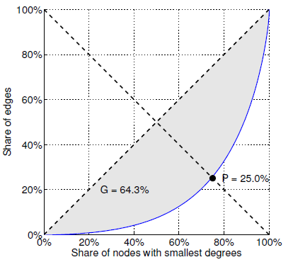
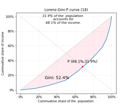
Figure 2. Statistics associated with the Pareto principle. […]The Lorenz curve (continuous line) gives rise to two statistics: The Gini coefficient G is twice the gray area and the balanced inequality ratio P is the point at which the antidiagonal crosses the Lorenz curve.
The ‘the balanced inequality ratio P’ that Kunegis and Preusse identify is typically used in a statement echoing the Pareto principle, e.g.: P% of all <users/objects> account for X% of all <some measures/resources>.
The Gini coefficient or ratio:
This ratio is a measure of the statistical dispersion of a distribution. True, it’s mostly used in economics, biology and ecology, but any paired series can have a Gini ratio as long as they can be normalized, then accumulated. Analytically, the Gini ratio is defined as half of the relative mean absolute difference.
The Gini coefficient can be obtained graphically:
Graphically, the Gini coefficient is a ratio of two areas: the area A, between the line of perfect identity or diagonal and the Lorenz curve and the total area under the diagonal.
The area below the diagonal is equal to half the total area of the square. If you call B the area below the diagonal and below the Lorenz curve, then the expression for the Gini coefficient, G is: G = A/(A+B). Since A+B = 0.5, G = 2A.
I used this straightforward approach in order to obtain and display the coefficient on the plot.
Examplar output of the function LorenzGiniP.plot_lorenz_GP():
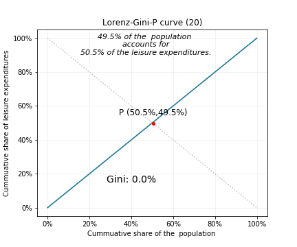
Gini = 0%: fair distribution of Y among X:
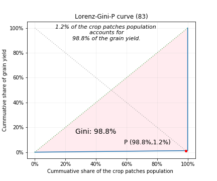
Gini = 100% when ~ 1 has ~ all:
Gini = intermedate for other cases:
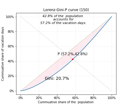
This last plot was created from two cumulative series in a Pandas DataFrame:
Hope this helps!
You can view the code in ./lgp_curve/LorenzGiniP.py.
The Lorenz_Gini_P_curve notebook has the coding details (imports, calls, etc.).
The Gini ratio was calculated using interpolation and integration: it will likely not be equal to the analyticaly calculated ratio; my guesstimate for the discrepancy is 0.05 to 0.1.
Dependencies:
- python 3.
- numpy
- scipy (for .integrate.trapz)
- pandas
- matplotlib
TODO:
- Refine plotting function to pass style dict for plot text
- Refine plotting function to pass style dict for figure save options.
- Check discrepancy of Gini value viz analytical solution