
Cut the bar chase!
‘Bar chase’ plot
A bar chase plot is an animated, ranked bar plot that is meant to show changes in ranking over time. The animation shows the typically horizontal bars change positions, akin to a ‘race to the top’.
I first encountered such a graph in a BBC graphic about COVID-19 cases (at bottom of page). I’ve reproduced it with country assigned colors using the daily data compiled by the center for Systems Science and Engineering (CSSE) at Johns Hopkins University.
Data-driven, dynamic visualizations can run amok!
The animation can be an appealing way to convey the changes in the top N categories over time where each of them seems to be “racing for the top”. As with all visualizations, it forces the reader to use visual clues to extract information, e.g. to answer the basic question “What is this gif showing?”.
Here is an example:
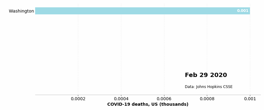
Each image in the gif displays the ranked bar plot of the top 10 countries or US states in COVID-19 fatalities as categories and cumulative number of deaths as bar values. Over time some categories will disappear from the top 10 ranking, while others will stay in the top 10 for many days. Some bars that persist in the top 10 ranking over a period of time will shrink due to the population differences and time of infection compared to over-ranked categories. Yet, the data is increasing. This leads to a complete disconnect viz the displayed values: the visual clue contradicts the data.
As a producer (coder) of such a report, this ‘strangeness’ is quite understandable: it is the ranking itself that is visualized, the values are ‘extra info’. Yet as a consumer (reader), it is completely psychotic as there is no resolution possible between the visual clues and the numerical information that is displayed. Therefore, this visualization SHOULD NOT be used as is.
Possible remediation… with “Caveat codor”
Since the point of this gif is to show the evolving ranking over time, that is all it should display: adding values will lead to the wierdness described above. Thus, a solution is to only show the categories (names) switching position in the top 10 slots.
A caveat about the appropriateness of such a ‘race to the top’ would remain, though: it is probably fine in the context of games or sports data, but not for pandemic tolls!