An Age Pyramid in Altair
Charting an Age Pyramid in Altair
Altair is a declarative statistical visualization library for Python, based on
Vega and Vega-Lite, and the source is available on GitHub.
import altair as alt
from vega_datasets import data
from altair.expr import datum, if_
If you are running this code in a Jupyter notebook (as opposed to a JupyterLab book),
uncomment the next cell and run it to enable rendering in the notebook session. ###
# alt.renderers.enable('notebook')
If you are using a notebook and fail to run this cell, the following error is displayed:
<VegaLite 2 object> If you see this message, it means the renderer has not been properly enabled for the frontend that you are using. For more information, see https://altair-viz.github.io/user_guide/troubleshooting.html
Perhaps, you simply forgot?
If so, you may still run into trouble, as I did when I switch to the Jupyter notebook. When you run the cell, you may get this other message:
ValueError: To use the ‘notebook’ renderer, you must install the vega package and the associated Jupyter extension. See https://altair-viz.github.io/getting_started/installation.html for more information.
Since I had installed Altair for Jupyter only, I needed to install the missing components
in my local environment:
conda install -c conda-forge notebook vega
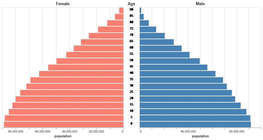
This is a correction of the Gallery example, which renders an inverted age pyramid.
pop = data.population()

# Get the min and max of the slider tool from the dataset:
slider = alt.binding_range(min=pop.year.min(), max=pop.year.max(), step=10)

# If name is None or not given, the default slider title of "selector<nnn>" will be used;
# Note 1: The <nnn> portion change as per the number of time the chart has been refreshed.
# Note 2: name (or default string) is automatically concatenated with "_" (?) and fields.
# Note 3: To my knowldege, the slider does not take an initial value, which could be min by default,;
#             Instead, the initial position seems to be the middle of the range, but not quite.
#             Also, the initial position is not labeled.

select_year = alt.selection_single(name='Select', fields=['year'], bind=slider)

base = ( alt.Chart(pop).add_selection(select_year)
                       .transform_filter(select_year)
                       .transform_calculate(gender=if_(datum.sex == 1, 'Male', 'Female')) )

title = alt.Axis(title='population')
color_scale = alt.Scale(domain=['Male', 'Female'], range=["steelblue", "salmon"])


# Try this: change alt.Y with alt.X, and keep all else the same: there should not be any difference.
# My guess is that these are methods for encoding axes, so the assignment does not really matter:
# its the lower case x and y assigned to them that matter.

left = ( base.transform_filter(datum.gender == 'Female')
             .encode(y=alt.Y('age:O', axis=None, sort='descending'),
                         x=alt.X('sum(people):Q',
                         axis=title,
                         sort=alt.SortOrder('descending')),
                         color=alt.Color('gender:N', scale=color_scale, legend=None))
              .mark_bar().properties(title='Female') )

middle = base.encode(y=alt.Y('age:O', axis=None, sort='descending'),
                                 text=alt.Text('age:Q')).mark_text().properties(width=20, title='Age')

right = ( base.transform_filter(datum.gender == 'Male')
              .encode(y=alt.Y('age:O', axis=None, sort='descending'),
                          x=alt.X('sum(people):Q', axis=title),
                          color=alt.Color('gender:N', scale=color_scale, legend=None))
               .mark_bar().properties(title='Male') )

# Concatenate the three charts horizontally, same as using alt.hconcat(left, middle, right):
left | middle | right